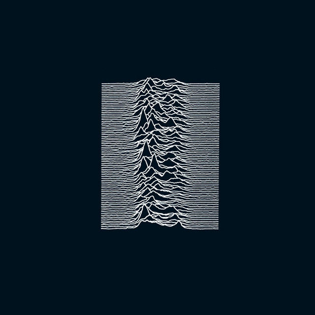
Unknown Pleasures
Joy Division
Type
Graphic design
Description
The lines on the front of Unknown Pleasures are data. They plot successive radio pulses from CP 1919, the first pulsar ever discovered, stacked one above another so that they look like a mountain range. Radio astronomer Harold Craft made the plot at the Arecibo Observatory for his 1970 doctoral thesis. It later appeared in The Cambridge Encyclopaedia of Astronomy, where Joy Division found it. Accounts differ on whether Bernard Sumner or Stephen Morris picked it out.
The band gave the image to Peter Saville, who had been designing posters for Manchester's Factory club. Saville made one decisive change. The original printed black lines on white, and the band said they preferred it that way, but Saville reversed it to white on black. "I was afraid it might look a little cheap," he explained, adding that he was "convinced that it was just sexier in black." The first pressings were printed on textured card, which made the stark image feel like a physical object. The band's name and the title appear nowhere on the front.
For years Craft had no idea his thesis plot had become a post-punk emblem, until a friend told him; he later bought a copy of the record. The image outgrew the album. It was adopted by goth fans in the late 1980s and has since appeared on clothing by Raf Simons and Supreme, and Vince Staples built a 2015 album cover on it.
Credit
Design by Peter Saville and Chris Mathan; pulsar plot by Harold D. Craft Jr., reproduced from The Cambridge Encyclopaedia of Astronomy
Artist
Joy Division
Genre
Rock
Label
Factory Records
Country of Release
United Kingdom
Year
1979